
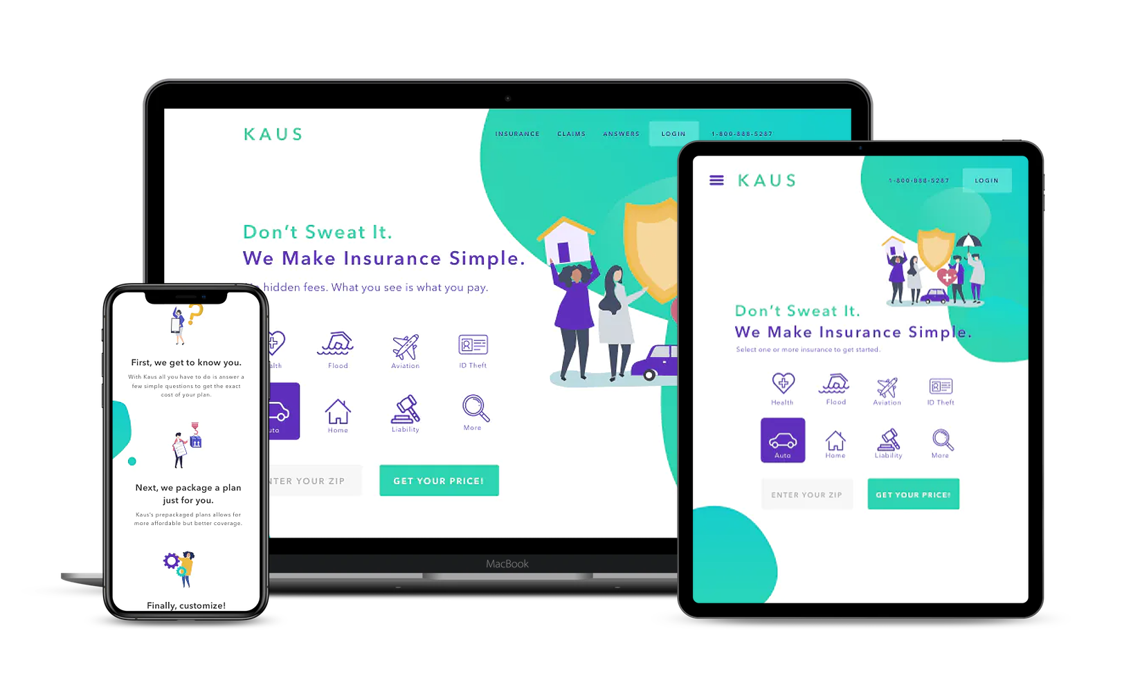
Problem
The company needs a brand refresh, and a website where visitors could browse through their 350+ insurance offerings and easily filter by relevant data. Kaus hopes to provide easy, online access to insurance policies of all sorts while keeping costs low and providing easy solutions for customers.
Solution
The rebranded insurance company will attract and help their online customers by providing a questionnaire specific to each insurance that automatically sifts through the 350+ policies choosing the best option for the user. When reviewing the plan chosen for them by the specific questions they answered, they will be able to read in lay-mans terms the descriptions of all the coverages included.
Process:
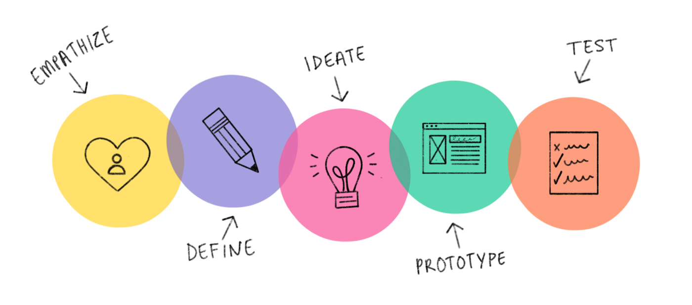
Empathize
Research Goals
1. Analyze types of insurance policies offered by market competitors.
2. Understand how insurance policies are organized and categorized by competitors.
3. Identify competitor insurance companies currently on the market.
4. Discover any user pain points with shopping for insurance both online and by other means.
2. Understand how insurance policies are organized and categorized by competitors.
3. Identify competitor insurance companies currently on the market.
4. Discover any user pain points with shopping for insurance both online and by other means.
Methodologies
My primary research included drafting a survey and sharing it with people who fit the participant criteria as well as self immersion in existing platforms to experience usability first-hand. My secondary research included a review of literature, definitions of related terminology, and a competitive market analysis.
Survey Results
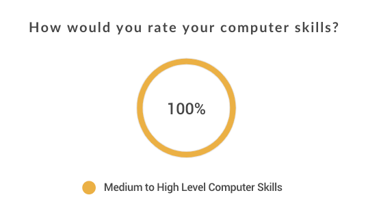
Using Google surveys I collected data from 30 participants.
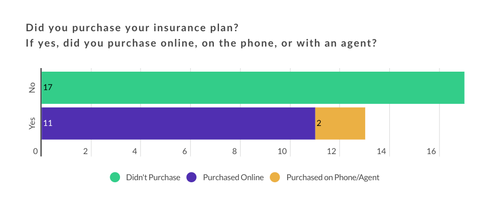
Of the 17 participants who required assistance purchasing insurance, majority reported being overwhelmed by having many choices and claim to have little knowledge of insurance.
“I have difficulty navigating the insurance system.”
“I need to be walked through the process.”
“I don’t understand insurance jargon.”
“I don’t know the first thing about insurance.”
“I need to be walked through the process.”
“I don’t understand insurance jargon.”
“I don’t know the first thing about insurance.”
Of the 13 participants who purchased insurance themselves, majority reported having to call the company to either ask questions or to complete the process.
“I had no idea how to answer some of the questions they asked me such as ‘What is the material of your apartment?’”
“Waiting online for help was such a hassle.”
“There were no simple online options.”
“I needed a representative to explain the policies to me.”
“Waiting online for help was such a hassle.”
“There were no simple online options.”
“I needed a representative to explain the policies to me.”
Competitive Market Analysis
After analyzing three online insurance competitors Trove, Lemonade, and Geico, I found that Geico provides all insurances however there is little explanation of insurance types and the consumer has to know exactly what they are looking for to manage the site properly. Lemonade, while it only provides home, renters, and item insurance does have a friendly and light-hearted vibe that is inviting to consumers. They also use a P2P network which is more secure and transparent although also understudied and relatively new. Lemonade like Trov files claims in minutes vs. weeks and both have very easy questionnaires to fill out.
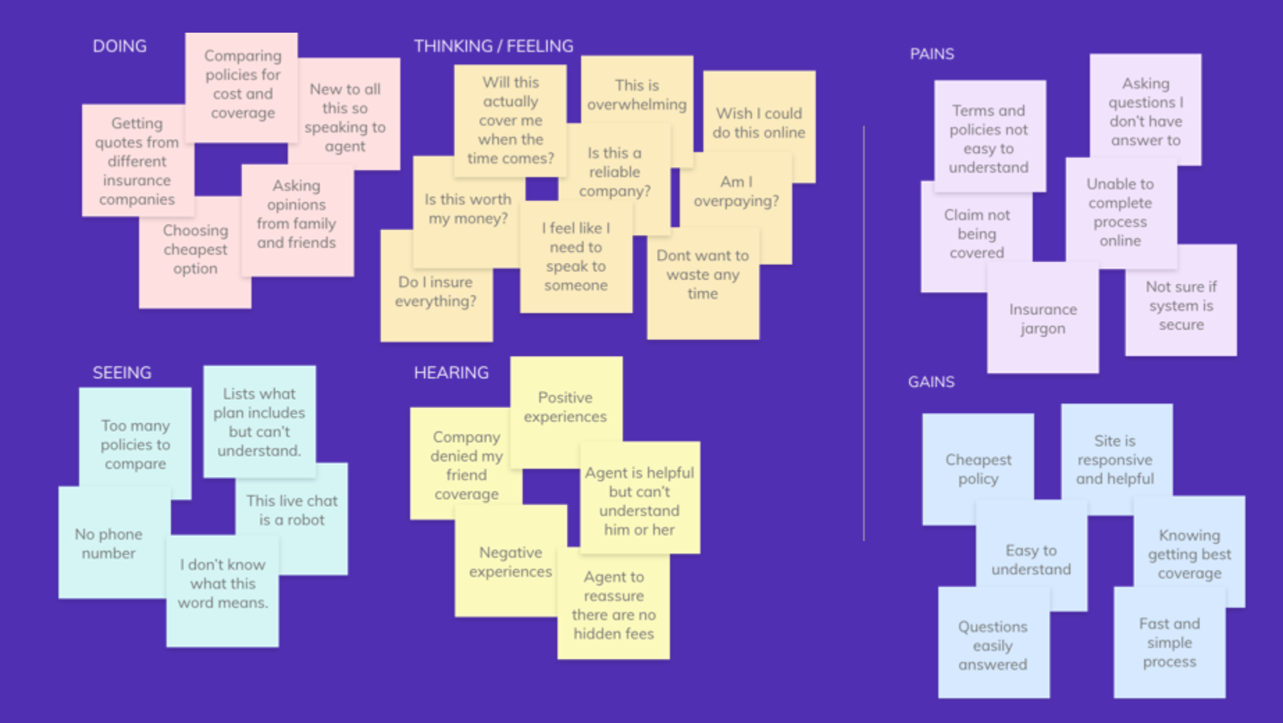
Define
I translated the data I acquired through the above research methods into an empathy map. From there, I was able to find patterns which were translated into insights, helping me define the user’s needs.
Persona
Let’s meet Gabe! Gabe is the reference point that I used throughout the project in order to create user centered design. I created Gabe to help me better empathize with the target user. Gabe’s persona is based off consistent and relevant data collected from my research.

Ideate
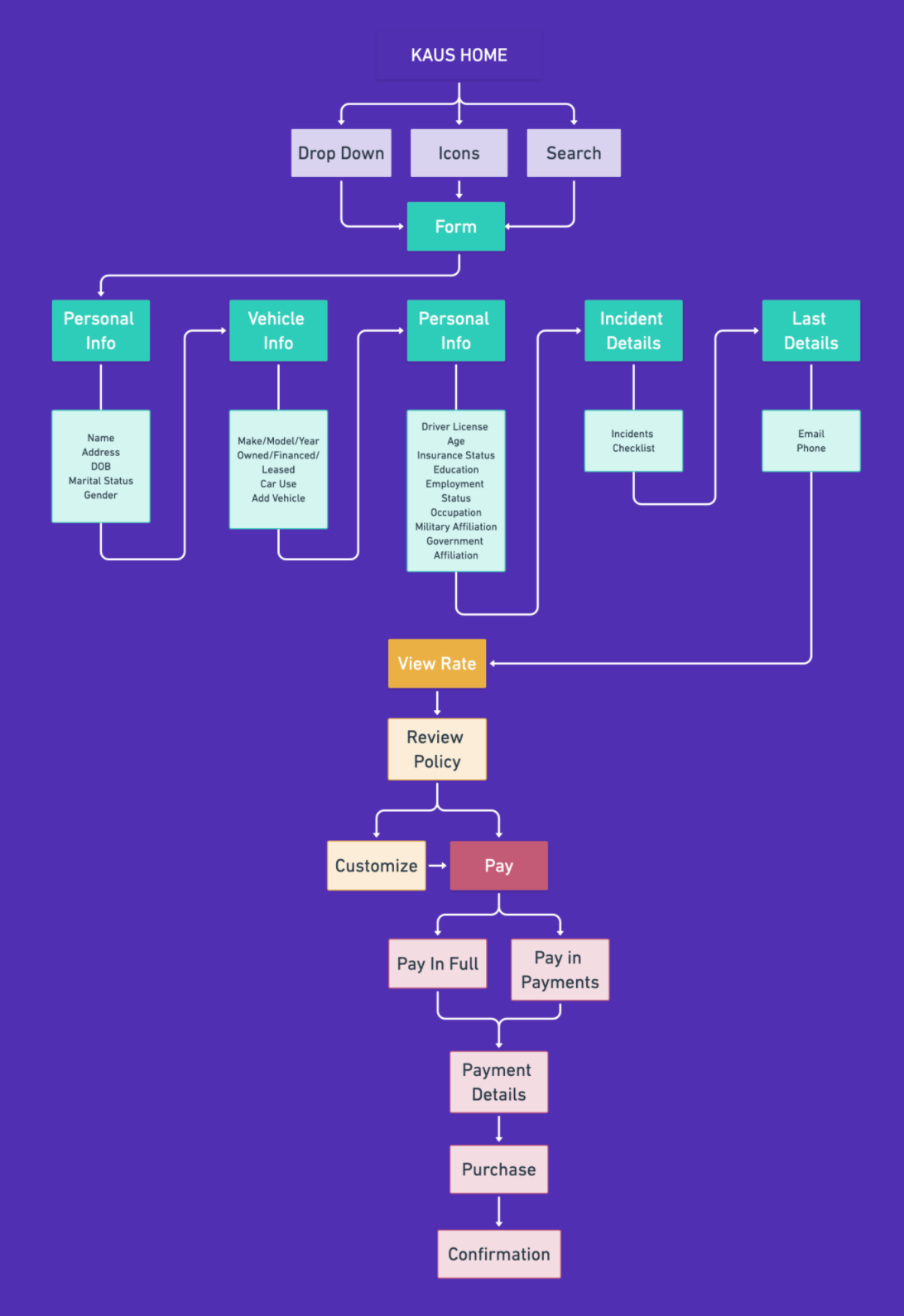
User Flow
Using Whimsical, I mapped out the user flow that Gabe would follow to purchase car insurance. This process helped me to consider every decision and action the Gabe would take in order to complete a task. See Gabe’s user flow below.
Activity Card Sort
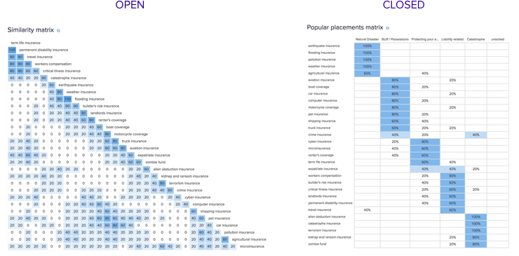
Activity Card Sort
I collected 5 participants and had users organize from list of 30 insurance types. For the open card sort users organized the insurance types into their own named categories. For the closed card sort users organized the same insurance types into a list of provided categories.
Since there weren’t enough participants, this card sort did not provide enough data. Instead I researched how other sites organized insurance types and used that as a reference.
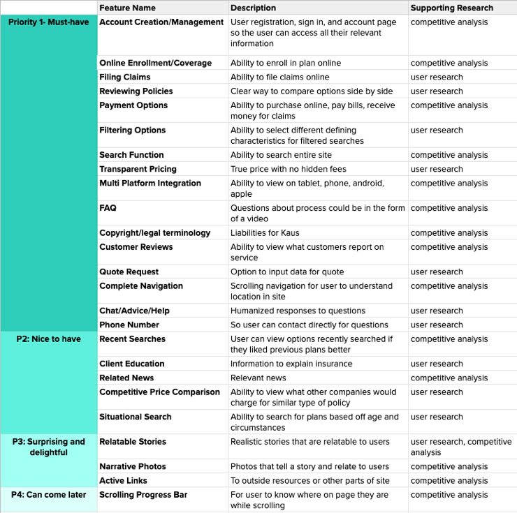
Product Feature Matrix
I created a list of features—key elements that should be included on the Kaus website. To do this, I first created an overall list of features necessary based on my user research conclusions, the business’ needs, Gabe’s persona, and the market I analyzed. Then I prioritized the features I listed based on their importance to Kaus and their users.
Design
Design Patterns
Design patterns are solutions that solve common, recurring design problems. They serve as a standard reference point for designers. I identified some design features that I would be including on the site such as a navigation/menu bar, a form, and a completeness meter. I then researched how competitors and other successful products accomplished similar tasks. Click here to view this study in depth.
Sketches
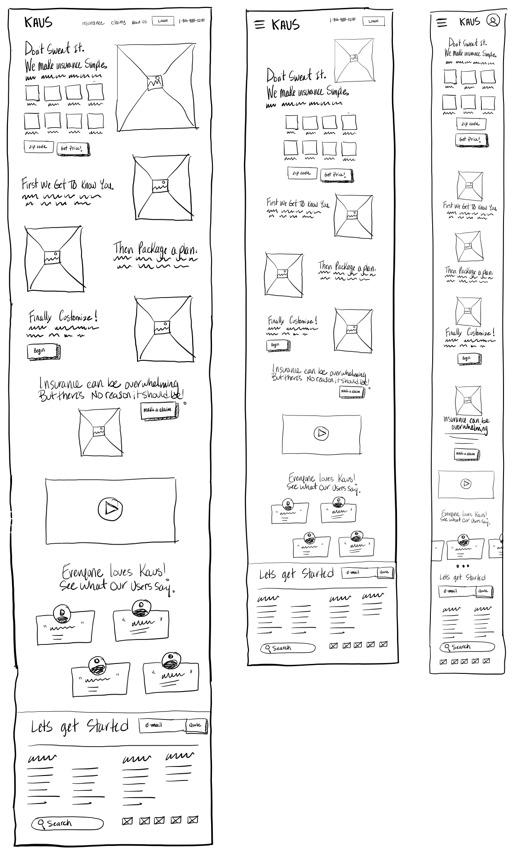
Low - Fidelity Wireframes
Branding & UI Kit
The Kaus brand is sophisticated and calming. It is meant to evoke reassurance and compassion. Purple tends to signify royalty and wealth while green signifies health, and restfulness. Kaus wants their users to feel like they are getting a quality product by not having to stress about the research and purchase process. Together with the secondary colors pink and yellow, Kaus creates a friendly and exciting brand. Click here to view the UI Kit
Creating a UI Kit helped me keep my design consistent throughout the site. I used repeated elements, buttons, text, and icons.
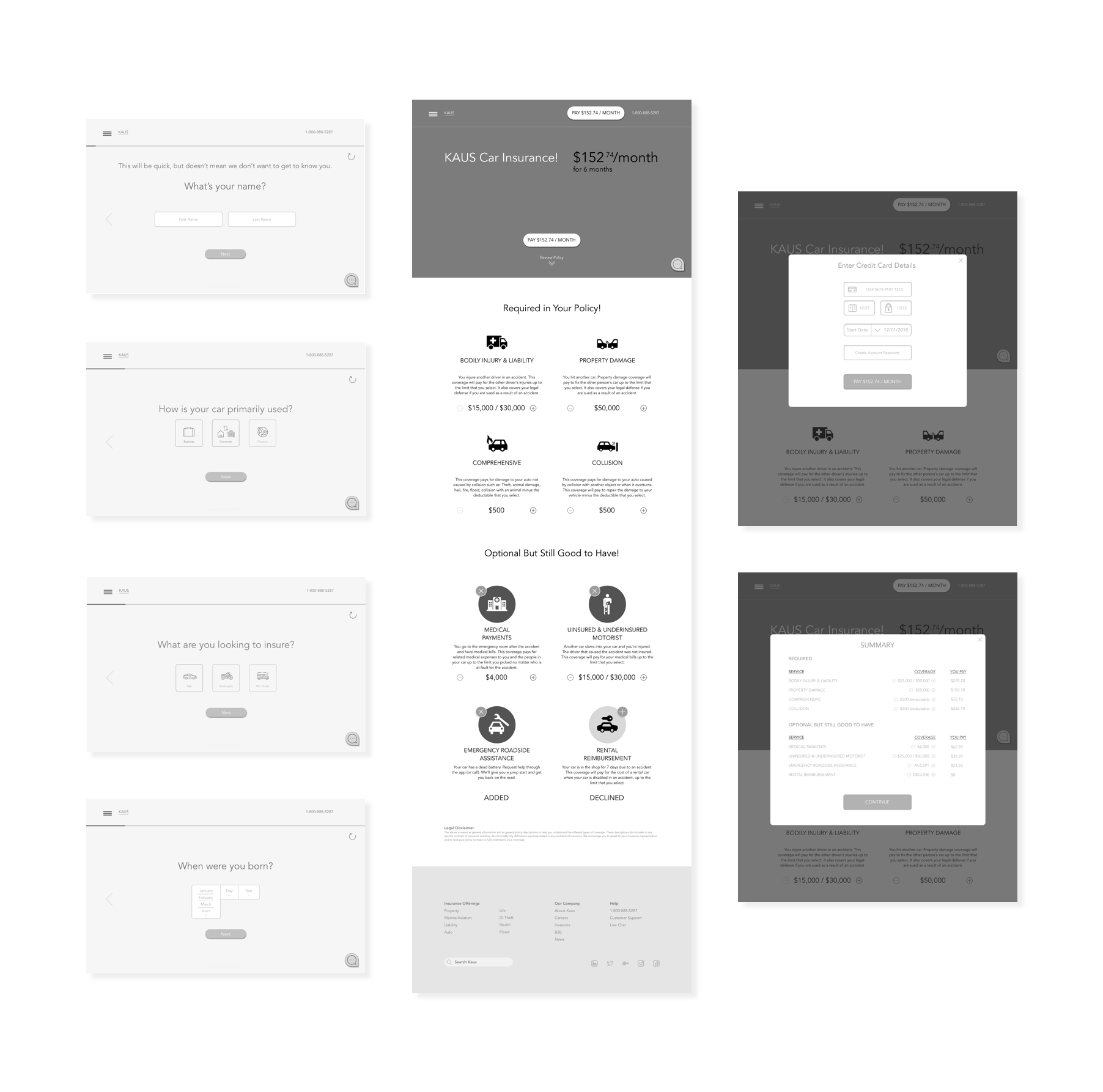
Prototype

Summary
Reflections
As I was conducting the surveys I felt I related well to the people who said someone else handles their insurance so they don’t have to. Instead of this deterring me from the subject I felt compelled to study it further. Why was it so hard to understand? Through this process I learned that yes, insurance is a very complex subject matter and there is A LOT of information to consider. However, protecting yourself and your belongings should never be that complicated, especially when you are paying for it as a service.
The insurance market is just beginning to find ways to be more transparent to their customers so that consumers understand where and why their money is being spent. This means that there are a lot of companies looking to do what Kaus has done and that there will be many opportunities on who can do things better. When thinking about the industry as a whole I hope I brought more awareness to the fact that there is a need for easier and more transparent purchasing of insurance. On an individual level my hope is that I made something as overwhelming as insurance as accessible and understandable to everyone as it should be.
Next Steps
1. Research questions specific to each insurance type
2. Design form and checkout process for tablet and mobile
3. Design and test the remaining pages
4. Continue to test & iterate
2. Design form and checkout process for tablet and mobile
3. Design and test the remaining pages
4. Continue to test & iterate
Challenges
Knowing what questions to include on the Kaus form was challenging because when studying multiple insurance companies and the questions they each ask, I found them all to have very different questions. I tried to pick the ones that I saw most commonly across all insurance sites that I studied.
I think it was a challenge working with such small sample sizes. My survey provided me with 30 responses which is a nice amount and provided me with insightful data however when studying the activity card sort I felt that 5 was too little to make any significant conclusions
Lessons Learned
Being that I am an artist I had to really learn to separate what I wanted to express to what the user wants and truly needs. Since completion of this project and all my UX/UI case studies I realize that my artistic skills make me a stronger designer but that I also have to make an extra effort to focus on the UX process and my users' needs. I think having knowledge and background in both makes me unique but what makes me stand out is that I understand the different importance each role plays.