Background
GivingWay was founded in 2015 as a two-sides marketplace connecting nonprofit organizations with passionate volunteers. In 2018 in response to market demand, GivingWay started providing online volunteering options. Then in 2020 GivingWay surpassed 5,000 vetted organizations and volunteers from all over the world. The global pandemic put travel on hold indefinitely and organizations turned to the GivingWay team and said their biggest need was funding. Therefore, from 2020-2021 GivingWay pivoted from a B2C to a B2B SaaS platform for online fundraising.
Project Details:
Team:
CEO, CTO, Business Dev, Customer Success, Marketing, Front-end & Back-end Developers
Timeline:
1.5 Months, weekly meetings with CEO, CTO, Business Dev
Tools:
Adobe XD, Adobe Illustrator, Google Analytics, Hotjar
CEO, CTO, Business Dev, Customer Success, Marketing, Front-end & Back-end Developers
Timeline:
1.5 Months, weekly meetings with CEO, CTO, Business Dev
Tools:
Adobe XD, Adobe Illustrator, Google Analytics, Hotjar
Problem
The moment you enter the B2B market, it’s a totally different feeling from the B2C market. Suddenly, we were dealing with a completely different, yet specific, audience. Instead of connecting passionate volunteers with charity organizations. I reviewed our analytics and data with our CTO and found that our fundraising tools were not being utilized to their utmost potential. We needed to improve our fundraising tools to increase sales of our Saas to nonprofits around the world.
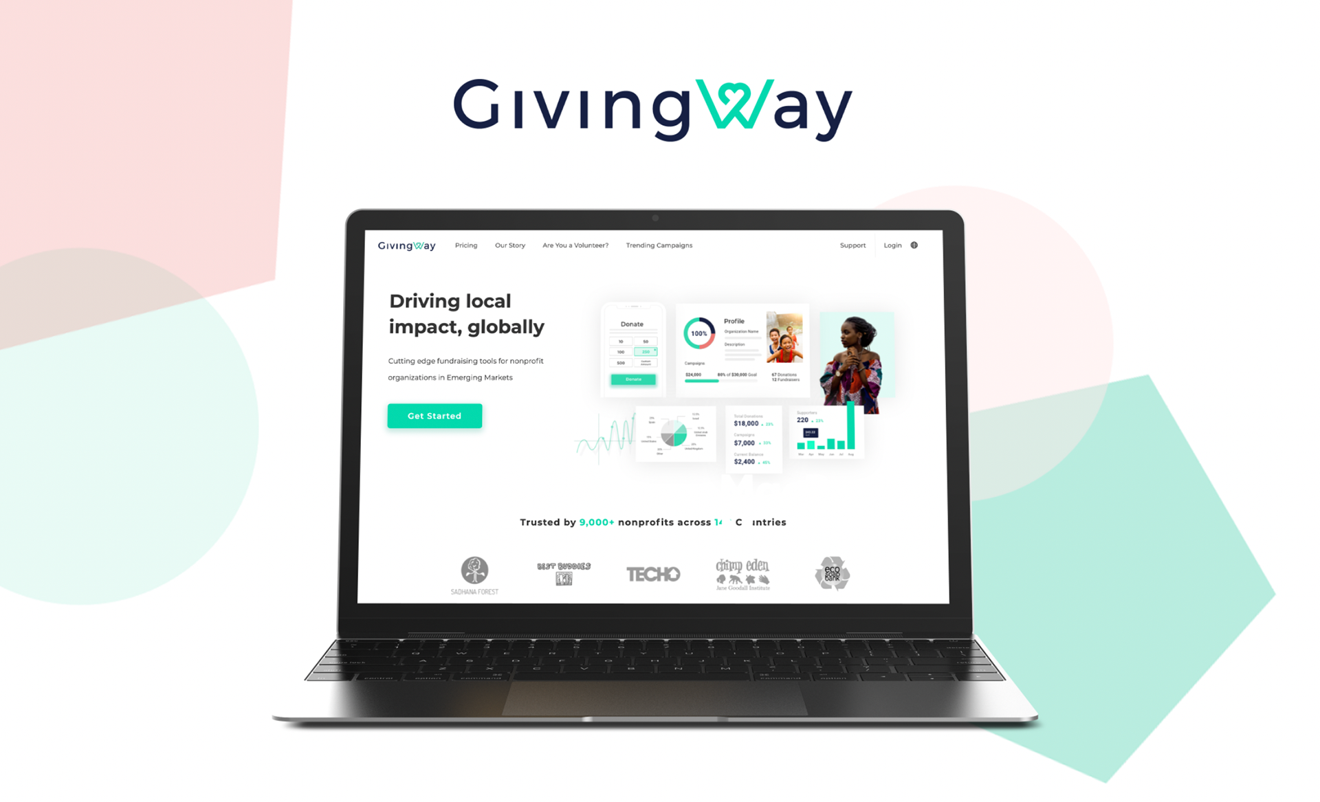
Solution
To aid the team in making this transition, I redesigned our website with our new audience user in mind. Additionally, since our main focus would be selling our SaaS donation platform, the tools on the platform including the nonprofit's profile page, donation pages, and campaigns also had to be redefined and tested. Below I take you through the process of the campaign page tool that I created from start to finish. The other aspects you can scroll through visually here.
Research
Nonprofit User Experiences
Users were creating campaigns but more than 50% did not finish the process.
Together along with customer support I interviewed:
6 of our loyal customers
2 of the users were successful in creating a campaign
1 of those 2 users managed to collect a few small donations.
6 of our loyal customers
2 of the users were successful in creating a campaign
1 of those 2 users managed to collect a few small donations.
Asked the following questions:
1.Can you tell me why you would want to create a campaign?
2.Can you walk me through how you would create a campaign?
3.Why have you started a campaign and not completed it?
4.While making your campaign what were some of the challenges you faced.
1.Can you tell me why you would want to create a campaign?
2.Can you walk me through how you would create a campaign?
3.Why have you started a campaign and not completed it?
4.While making your campaign what were some of the challenges you faced.
Insights
Some users thought they were creating a general donation page
Limited understanding of purpose of a campaign
Some campaigns were created by accident
Too many input fields
Required fields were information they didn’t have on hand (i.e. campaign descriptions or the total amount they wanted to raise)
Once submitted there was no flexibility to go back and change
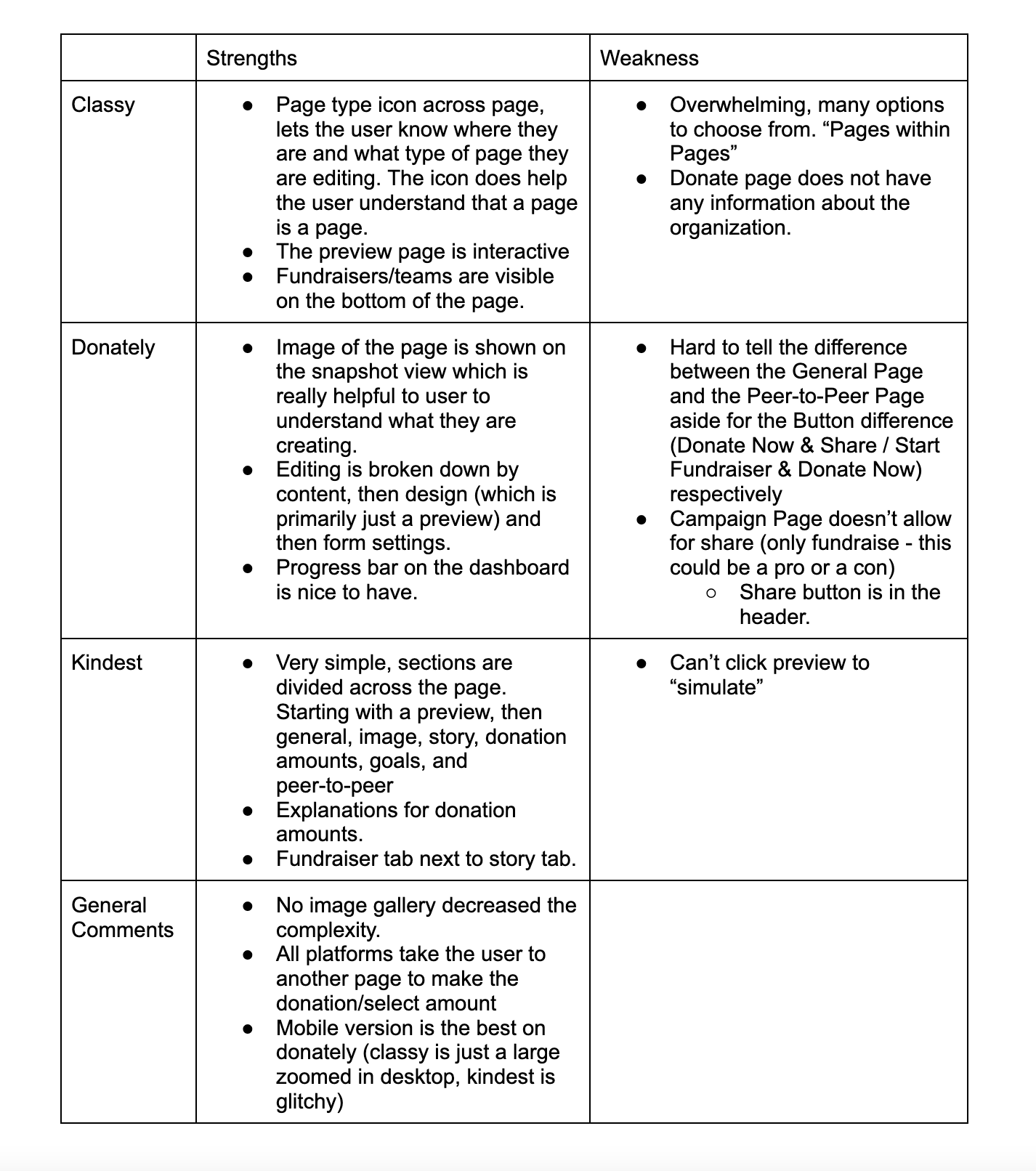
Market Research & Campaign Trends
I needed to get some insights into our competitor platforms to see what made other companies successful and to learn what we were lacking. I started by evaluating the strengths and weaknesses of each platform, Classy, Donately, and Kindest
Takeaways
Being able to view the page as edits are being made. This highlights purpose, visual understanding, and motivation to continue.
Mobile responsiveness of Donately.
Being able to view the page as edits are being made. This highlights purpose, visual understanding, and motivation to continue.
Mobile responsiveness of Donately.
Donor User Experiences
While the donors are not our direct customer, they play a huge role in both the businesses and the nonprofits success. Therefore, I had to study what makes a donor give a donation.
Insights:
Increase reliability - Good design including spacing, organization, clarity
Be direct – concise and direct language
Don’t clutter – too much clutter is distracting
Create impact – with as little as possible, a large image, or one or two photos
Consider mobile
Increase reliability - Good design including spacing, organization, clarity
Be direct – concise and direct language
Don’t clutter – too much clutter is distracting
Create impact – with as little as possible, a large image, or one or two photos
Consider mobile
Ideation
Persona
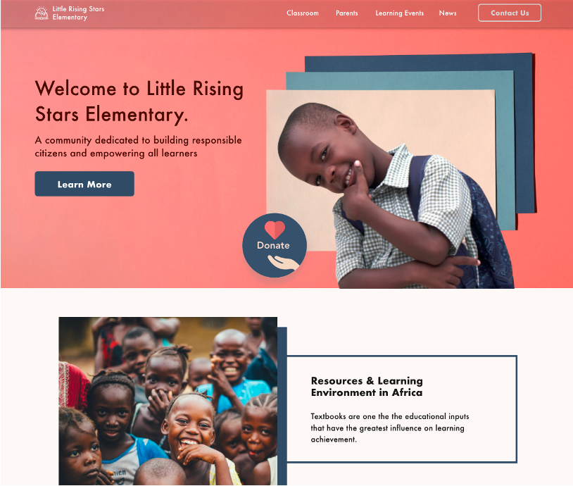
Little Rising Stars is the persona I created for myself and the team to resonate with the nonprofit and potential donors. We are an organization dedicated to building responsible citizens and empowering all learners. They run an after-school program for children of their village with a place to play, learn and enrich themselves.
Little Rising Stars wants to build a library to provide their children with resources for education. They would like to build a campaign to raise money, but they are overwhelmed by the process, don’t have a clear plan yet, and don’t know how much money they need for the library.
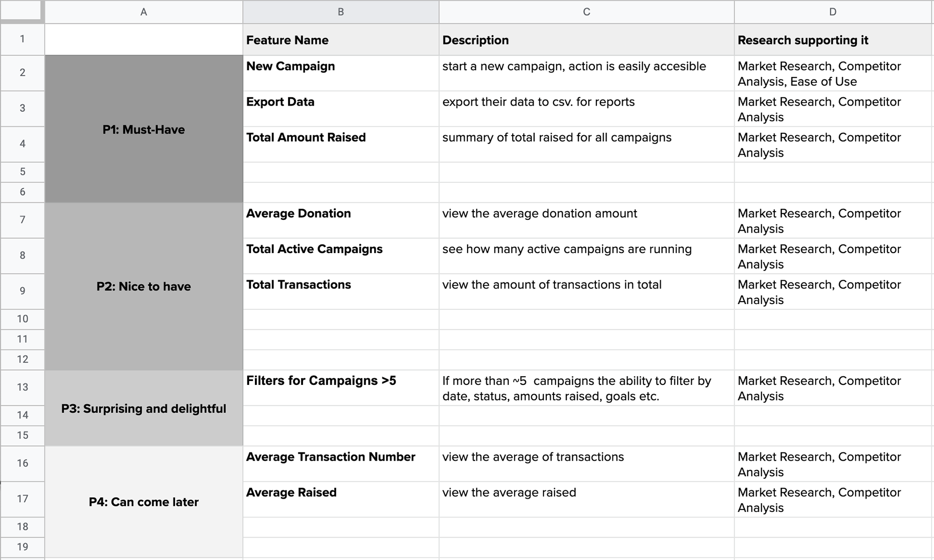
Product Feature RoadMap
Here I created a product feature RoadMap that included a campaign overview, list view, and ability to edit campaigns. I did this in order to prioritize features and plan ahead for the MVP.
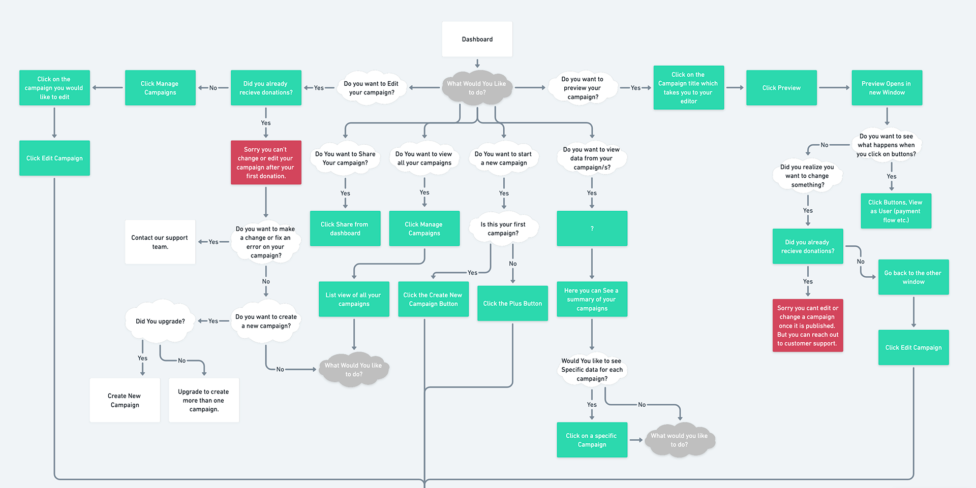
Decision Tree
I used all the information I collected and created a decision tree because I wanted to experience the user journey and make sure all the features from the product roadmap would be included. This also helped me plan better technical specs for the development team as I was able to go through every action and state. Overall this just helps make design easier!
Here is a screenshot of the first part of the Decision Tree. Click here to view my workspace on whimsical.
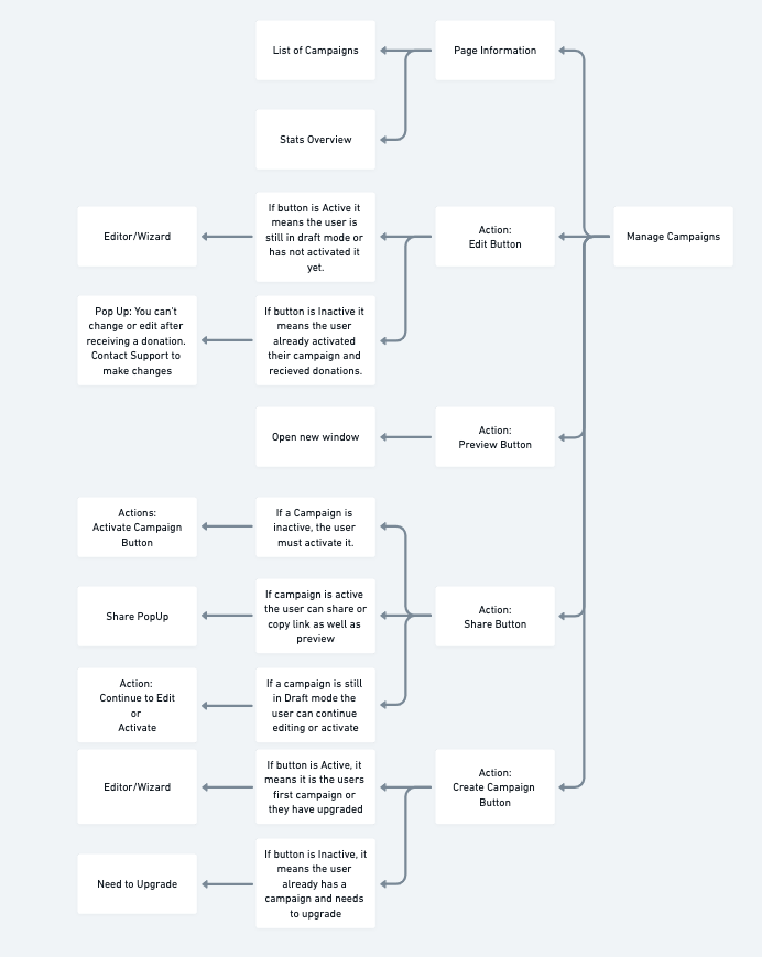
Technical Specs
Together with the development team we decided that for us to execute the best product I would provide them with technical specs that would provide them with the information they needed to build proper frameworks and structures as well as account for all states. Here is a screenshot of the specs.
Design
Wireframes
To begin the design phase I started with high fidelity wireframes which allowed me to sketch out ideas and simulate the experience as well as find problems, flaws, and make improvements. Below included a side navigation bar that helps the user understand where they are. I also included a snapshot of organization data including total amounts raised, average donations, number of campaigns, and total transactions. I also included a CTA to create a new campaign.
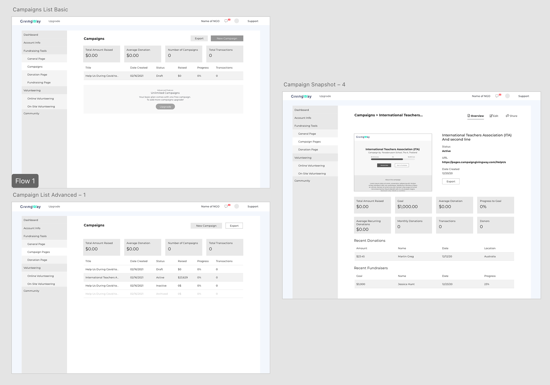
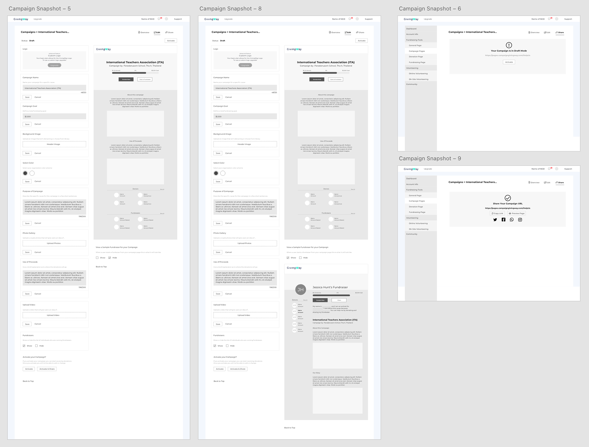
Here I demonstrated how the campaign editor would look. The left side would be the form fields and the right side would show how the campaign would look in actuality.
Prototype
I presented my team with a simple prototype so that I can test understandability and give users a feel for how the product would work. The following prototypes were built on Adobe XD for desktop and mobile.
Test & Iterate
I provided the prototype to the rest of the team. The feedback given suggested that I overlay the editing fields on the draft of the campaign instead of side by side so that the users have a better view of the actual campaign page. The following is an example of the editor for a campaign led by Paradanusorn School in Thailand.
Summary
This was only the beginning of our path to re-evaluate our products from a B2B marketing perspective. I led this project from start to finish and was able to provide the team with lessons learned. I would have really liked to perform more user testing. I think with speaking to our users I would have been able to hone in on important details that otherwise may have been overlooked.